Johns Hopkins UniversityEst. 1876
America’s First Research University
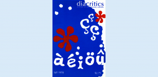
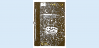
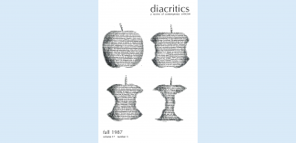
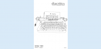
50 Years of Provocative Diacritics Covers

Founded in 1971, Diacritics publishes original work in and around critical theory, broadly conceived. Diacritics offers a forum for thinking about contradictions without resolutions; for following threads of contemporary criticism without embracing any particular school of thought.
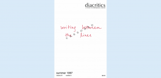
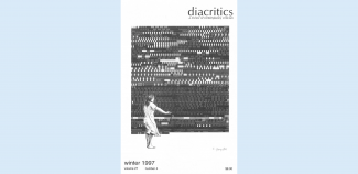
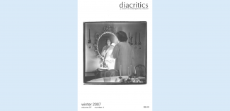
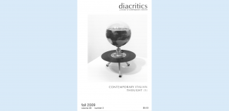
Since its inception, every issue of Diacritics features a unique cover design. The journal's cover has always been a bold and conscious choice by the editors. Some cover illustrations are directly related to one of the essays or to the theme of the special issue; others are simply visually arresting or provocative in some way.
In 2014, Diacritics took home the "Best Journal Design" award from the Council of Editors of Learned Journals (CELJ).
This year marks the journal's 50th anniversary. The journal's editorial website includes an archive of its entire history, and scrolling through the over 170 issues is as visually arresting as the content within its pages. We asked Editor Karen Pinkus and Managing Editor Hannah Miller to select some of their favorite / most notable covers from Diacritics' five decades in print, which we've collected in the gallery below.
For more information on the journal's design history, check out this interview with Emoretta Yang, Graphics Editor of Diacritics from 1976 to 1989.
Congratulations on fifty years!
