Johns Hopkins UniversityEst. 1876
America’s First Research University
The Black Skyscraper and the Urban Sensorium

On the occasion of the paperback release of The Black Skyscraper: Architecture and the Perception of Race, I want to reflect on two images—one that appears on the book’s cover and one that does not feature in the book at all but is equally illustrative of its themes.
First let me say a word about the kind of image I did want for the cover—a triumphant image of a skyscraper cresting romantically upward towards the sky. Such images, isolating buildings from their surrounding context in order to emphasize their massive monumentality, epitomize what historian Peter Hales calls the “grand-style urban photography” emerging between 1870 and 1893. Aiming to capture the orderly stateliness of the built environment, these photographs neutralized the allegedly more unruly aspects of urban life potentially contaminating its vision of planned constancy.
The Black Skyscraper is not a book about the monumentality of the early skyscraper or the successful rationalization of the Gilded Age city—rather, it recovers the ways skyscrapers made their beholders feel vulnerable, disoriented, unmoored, indistinguishable, and out of control and how those sensations were racialized around the turn of the 20th century. Whereas images paying homage to the singular monumentality of a skyscraper surging upward and away from the city endorse the fantasy of the rational metropolis, my book examines representations that figure skyscrapers as interrupting the fantasy of a universally stable mode of racial perception portable across different physical and social contexts. In examining writing about the early skyscraper during the first few decades of its invention—which includes work not just by fiction writers but by journalists, theorists, thinkers, public figures and architects themselves—a new story about the skyscraper emerges as a fount of racial anxiety but also a site for experimentation regarding this architecture’s impact on how race was both perceived and felt.
Skyscrapers appear in turn-of-the-century narratives as radical reformers of the experience of race. People looked drastically different depending on where one stood in and around these tall structures—appearing as ant-like black specks when viewed from the top or as fragmented volumes when glimpsed from the dense streets at its base this architecture helped to populate. The skyscraper raised questions about how one might make a racial judgement about others in in the wake of the changing perceptual conditions this architecture helped to foster. But not only was the ability to read race seemingly jeopardized by this architecture, but the capacity to feel raced as well, with white authors in particular described feeling less like self-governing white agents in the skyscraper’s shadow and more like mechanized automatons or even chattel slaves. Whereas some writers—including a few key Harlem Renaissance figures—embraced these disorienting conditions, contemplating the liberating possibilities of the skyscraper’s distortion of race, many others expressed dread in the face of this architecture that seemed to narrow the perceivable gap between an urban person and an ethnic person. Affecting the ability to know oneself as raced, the early skyscraper appears in prose from this era as a disruptive force poised to unmake race.

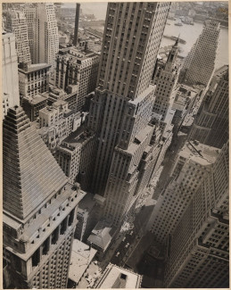
The image that graces the cover of The Black Skyscraper reflects the book’s efforts to recover the skyscraper’s influence on not only the shape of the city but the sensorium of its residents. The photograph was taken by Berenice Abbott and is titled Wall Street Showing East River from Roof of Irving Trust Co. Building, May 4, 1938. Abbott created this image as part of her documentary project, Changing New York, funded by the Federal Art Project, a New Deal Program helping to keep artists employed during the Great Depression. Abbott’s project came to include around 1,000 images eventually housed at the Museum of the City of New York.
The caption that Abbott and her partner Elizabeth McCausland provided for this image reads as follows:
The pyramidal roof of the Bankers Trust Co. Building, derived from classical architecture, is echoed in the modern setback silhouette of 120 Wall Street. In the roof's-eye view of the financial district, serrated roof-lines create a pattern like that of the West's vast canyons, in which soil erosion has carved out abstract sculptures of earth and stone.
In just a few words, this caption manages to summarize some of the earliest conventions of and key debates about skyscraper form: disputes between architects about whether it should be classically clad or dressed in more modern and nativist styles; clashes about how its outsized mass should relate to the street resulting in the 1916 New York zoning laws mandating setback designs; and efforts to naturalize the cityscape as Western canyons initiated by 19th century city boosters seeking to make Manhattan enticing and approachable for native tourists.
But despite the caption’s attention to architectural detail and natural figuration that carefully situates the reader in real and figurative space, what most attracts me to this image is the experience of vertigo it conjures. From fifty stories high, the camera cranes down from the top of the Irving Trust Co. Building while capturing a vista extending all the way out to the East River. In between the street and the river, an array of skyscrapers surge up from the city with little rhyme and reason. Everything in the photograph appears on a tilted axis, making it difficult to locate where we as viewers are positioned in relation to what is above, below, and adjacent. 120 Wall Street, the skyscraper located in the photograph’s center, bursts up through the pictorial frame even as the camera tilts down to the street, tugging the viewer in opposite ways to produce a visceral sense of spatial tension.
Peering down at the street level in this photograph, one can distinguish between cars and people, but not between people and people. The figures below appear—to borrow the words of some of the authors I write about in the book—as dots, black specks, swarming ants, and fifty-thousand hats. What was to happen to the capacity to determine someone’s race in a city where the visibility of bodies could vary so widely depending on where and when you stood? Especially in light of new Jim Crow laws insistent on defining race as a matter of ancestry rather than visible physiognomy as well as the new waves of immigrants populating the city? And how could one feel certain of their own racial identity in an era when race was alleged to shape not just how you look but how you felt and acted? Although Abbott took this photograph a few years after the period in which the book is set, it still visually evokes the scenarios provoking questions about race’s perceptibility for writers of all stripes around the early 20th century.
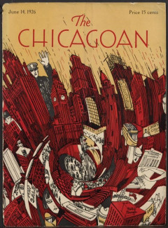
While Abbott’s photograph was taken from an actual inhabitable point in the city, the cover illustration for the June 14, 1926 issue of The Chicagoan more surreally represents the disoriented urban sensorium incited by the dense vertical city. Unlike Abbott’s muse of New York, this illustration renders Chicago, the city that first gave birth to skyscraper form. Given that New York and Chicago feature prominently in The Black Skyscraper, these two images are all the more fitting as interlocutors that together evoke the book’s preoccupations and predilections. Abbott’s image conjures a sense of vertigo through the various directions it commands the viewer’s gaze to follow. But the Chicagoan illustration exaggeratedly represents the experience of urban unsteadiness. The skyscrapers in this image, rendered in an urgent red, appear somewhat uniform when viewed towards the top of the drawing. But as your eye moves down their base, these buildings start to twist up into a swirling whirlpool ensnaring people, cars, headlines, and signs in its downward spiral.

The outsized cartoonish-looking cop looming over the image, standing next to the tallest skyscraper in the scene, evokes arguments by spatial theorists about the panoptic view the skyscraper made available to those at its top, equating this view with all-seeing omnipotence. But I’m more concerned in the book with the ways writers accuse the skyscraper of disordering rational perspective and empirical clarity. And this image seems more interested in this idea as well, placing its whirling cyclone of urban experience towards its center.
As the skyscrapers begin to curl around one another, their ensnaring whirlpool frames images of mass congregation in one part of the illustration while obfuscating and even slicing through individual faces in other parts. The violence the skyscraper exacts upon these perceptibly white faces visually evokes the harm that writers like realists and science fiction writers alike accused the skyscraper of inflicting upon white subjects by endangering their legibility in the city. This is the subject of The Black Skyscraper’s first chapter, “Architecture and the Visual Fate of Whiteness.” Alleged by one writer to be literally “drowned out” by the growing number of racial and ethnic others in the turn-of-the-century city, the white metropolitan was imagined by some to be further imperiled by skyscraper architecture additionally compromising her visual distinctiveness.
This image is chaotic but also chicly modern. In this way, it perhaps most intensely brings to mind a novel I write about extensively in the book: Nella Larsen’s 1929 novel, Passing. In a scene early on in the novel, protagonist Irene Redfield ventures into downtown Chicago for some shopping on a hot summer day. But she quickly finds herself overwhelmed by her environs. In her midst, buildings “shudder” and “quiver” like bodies, while bodies seem to “sear” and “drip” as if they were objects. A man in the densely congregated mass at street-level faints. Irene fears her own collapse will soon follow as dampness spreads across her body, “soiled from contact with so many sticky bodies.” She is saved from her coming collapse, however, by a cab that whisks her away to a cool rooftop getaway. This Chicagoan illustration echoes the experience of urban disorder that Larsen would describe three years later.
Even as Irene experiences intense physiological distress in the city center, she is relieved of another urgent concern simultaneously—her fear of being ‘detected’ as a black woman despite being light enough to pass as white. The intensity of Irene’s experience in downtown Chicago surrounded by skyscrapers causes her to lose almost complete control of her mind and body. And yet, given that so much of Irene’s attention when she is in public is often devoted to her anxiety over her possible racial detection, Irene’s disorientation at the feet of skyscrapers provides a perverse form of relief. The Chicagoan cover depicts the swirling cacophony of urban sensation facilitated by the skyscraper, rendering these effects as beautiful, even potentially pleasurable, in its capacity to rearrange the city. Whereas white metropolitans feared the skyscraper’s capacity to disorder their perception, Larsen and other black writers explored the potential emancipatory benefits of the skyscraper’s capacity to scramble the racial sensorium.
Together, these images suggest the sense of fear, rapture, hope, and anxiety about race’s legibility and endurance that the skyscraper provoked in its earliest beholders. As I continue to write my next book—which picks up where The Black Skyscraper leaves off to consider how the 20th century project of mass homeownership helped to re-stabilize the racial sensorium disordered by the urbanization the skyscraper framed—I look forward to finding images that are equally as evocative of the dynamics I seek to unfold.
Adrienne Brown is an associate professor of English and the Director of Undergraduate Studies at the University of Chicago. She is the coeditor of Race and Real Estate.


