Johns Hopkins UniversityEst. 1876
America’s First Research University
National Ampersand Day

On the occasion of National Ampersand Day, a note from our editorial director who probably has a few other things to do--
Some weeks the work of publishing can seem endless. My summer to-do list has become a crumpled document with embarrassingly few items crossed off. In our perpetually busy world, my answer to what I did today is always “… and … and … and … and ….” In Ecclesiastes, even the Ancients recognized that, “of the making of books there is no end.”
It seems particularly appropriate that we’ve developed a short-hand for our multitasking, the deceptively simple ampersand. We use it in meeting notes, emails, and text messages. When composing a tweet, it can be the most useful little character.
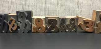
This logoform has a curious history with two aspects worth noting. First, the ampersand is a ligature formed by the linking of an “e” and “t” forming the Latin word et or and. It turns up on medieval and Renaissance manuscripts as scribes use the abbreviation to squeeze a tight line. The form was so useful that printers never thought twice about adopting it when they began setting moveable type. Just as the digital world has reinvented uses for the @ and #, we retain the & because of its absolute utility.
The second aspect is its curious name. The form came to be considered a non-letter member of the alphabet. As school children learned their ABC’s, they would recite the letters “… X, Y, Z, and per se and,” that is, “and, by itself, and.” It’s easy to imagine kids mumbling, “ampersand,” and by the early nineteenth century the name stuck.
As commercial type design flourished over the last three centuries, designers used the last letter as their own personal artistic expression. An M, after all, always had to look like an M, and an O had to resemble other O’s, but forms of the ampersand were less set. For the anonymous type designer, the ampersand was an occasion for creativity, a final signature on a typeface.
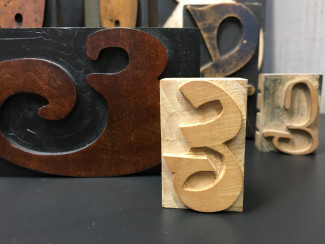
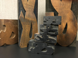
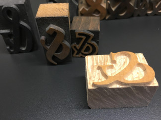
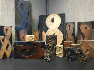
Anyone who has been in my office knows of my quirky collection of wood type ampersands, close to a hundred examples from all over the world. I like them because they remind me of the long history of language, of the scribe’s hand trying to fit a line of text on a page, of how language and letterforms are passed down over the centuries, and of how they too are expressions of human creativity.
They also remind me of all the things still on my to-do list.
Greg Britton is Johns Hopkins University Press editorial director. You can follow him on Twitter at @gmbritton
