
Johns Hopkins UniversityEst. 1876
America’s First Research University
Now Browsing:
Designer Bob Cronan on “Distilling Complexity Into Straightforward Visuals”
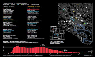
JHU Press recently invited me to comment on my collaboration with them over the past decade, creating maps, infographics and spot illustrations for books. So far, I’ve completed more than 20 projects for JHU Press, including the double page graphic pictured above taken from Flickering Treasures: Rediscovering Baltimore’s Forgotten Movie Theaters (Amy Davis, Sept. 2017). Here are a few other examples of my work, along with some discussion on their development. A successful result is a combination of experience, useful art direction, and refinement through the revision process.
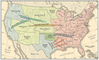
The first example comes from a forthcoming title, Breakaway Americas: The Unmanifest Future of the Jacksonian United States, (Thomas Richards, Jr., April 2020), for which I designed the cover art meant to resemble a vintage engraving. For guidance and inspiration, I began with the author’s rough sketch, reference material, and an old map supplied for style.
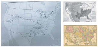
My first attempt (below) displayed the subject matter accurately, but it still lacked a convincing antique feel overall. JHUP’s art director, Martha Sewall, suggested some tweaks in my type selection, line weights, and color palette.
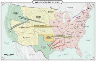
Thanks to Martha, my revised draft (below) hit the mark.
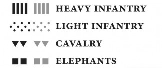
The next example, from this past fall, seemed to offer some creative possibilities. The Press asked me to produce simple battle diagrams for Killing the Republic: Citizen-Soldiers and the Roman Way of War (Steele Brand, September 2019), but I may have taken a bit more artistic license than expected. I crafted a set of hand-drawn icons: spears for light infantry, shields for heavy infantry, horse heads for calvary, and elephants. The only problem was that the author neither requested nor wanted my artistic interpretation. After starting over with a fresh approach based on geometric symbols, I organized the information more in line with the author’s original intentions. This lesson reminded me to pay close attention to the client’s needs and when possible, aim for simplicity.
![]()
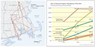
For a book published earlier this year: Ospreys: The Revival of a Global Raptor (Alan F. Poole, March 2019), I endeavored to organize the data in a concise and straightforward way. The compact clarity of these two examples below shows that a faithful adherence to the data is often the most effective method of presentation.
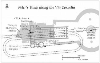
A single diagram I created for The Great Fire of Rome: Life and Death in the Ancient City (Joseph J. Walsh, October 2019), demonstrates the challenge of distilling complex information using only black and white. In addition to illustrating the progress of the Great Fire in Nero’s Rome with a series of maps, Professor Walsh asked that I merge several layers of history into a single diagram (see below). Overlaying varied content is always a challenge for clarity and readability, and these concerns are especially acute when limited to a single color. I worked through this hurdle by separating the epochs graphically. I gave the current Vatican site a gray fill to push it to the background, while outlining Old St. Peter’s in a darker gray to bring it forward. The Circus of Caligula and adjacent Via Cornelia are shown with thin, black dotted lines, and all monumental sites are labeled or symbolized in solid black. The differentiation of tone, line and type permit greater legibility without appearing cluttered — no easy feat.
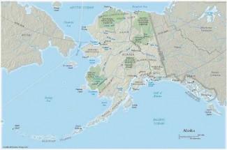
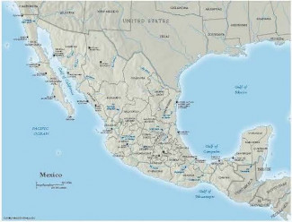
My final samples are taken from the strikingly handsome, two-volume set, Ducks, Geese, and Swans of North America (Guy A. Baldassare, published in 2014). The original idea was to fit all of a long list of place names onto a single map. When this intention quickly proved impractical, I suggested a series of four detailed regional maps to accompany a simplified orientation map of North America. Below are two of those regional maps, Alaska and Mexico.
As a graphic designer, I work with data in one form or another, distilling complexity into straightforward visuals — understandable at a glance when possible. Though limited to ink on a page, I take satisfaction in problem solving and shaping information beneficial to the professional and layman alike.
Bob Cronan is the owner of Lucidity Information Design, LLC, which is based in Baltimore, Maryland. A graduate of The Cooper Union for the Advancement of Science and Art, he previously worked as a cartographic artist with the National Geographic Society, and later, a graphics specialist at The Baltimore Sun before founding Lucidity in 1999. Learn more about his work at www.lucidityid.com or on Facebook at www.facebook.com/lucidityid
Login to View & Leave Comments
The Hopkins Press Podcast: Why we #TeamUp to make academic research engaging and accessible
Since 2016, the Hopkins Press Podcast has produced a steady stream of interviews with scholars and editors about their research published in the Hopkins Press Journals. Through this podcast, we aim to make academic research engaging and accessible through...

Hopkins Press goes All In to #TeamUP on the University Campus
Being an active part of our university community is a vital, ongoing goal for Hopkins Press. This year’s Democracy Day, held on the campus of Johns Hopkins University, was a great opportunity to accomplish that mission.The inspiring event, held on a crisp...

50 Years of Provocative Diacritics Covers
Founded in 1971, Diacritics publishes original work in and around critical theory, broadly conceived. Diacritics offers a forum for thinking about contradictions without resolutions; for following threads of contemporary criticism without embracing any...

Login to View & Leave Comments